


The Timeless Charm of Cracker Barrel’s Old Logo
Cracker Barrel is a beloved American restaurant and retail chain known for its Southern country theme and homestyle cooking. Over the years, the brand’s identity has evolved, but one thing that has always remained iconic is its logo. Today, we dive into the story behind the Cracker Barrel old logo, explore its transformation, and discuss the latest news surrounding the brand’s visual identity.
A Look Back: The Story Behind Cracker Barrel’s Original Logo
Cracker Barrel Old Country Store was founded in 1969 in Lebanon, Tennessee. The restaurant chain quickly became famous for its down-home Southern charm, rustic décor, and comfort food. Central to its branding was the original Cracker Barrel logo, which captured the essence of Americana and tradition.
Breaking Down the Old Logo’s Design
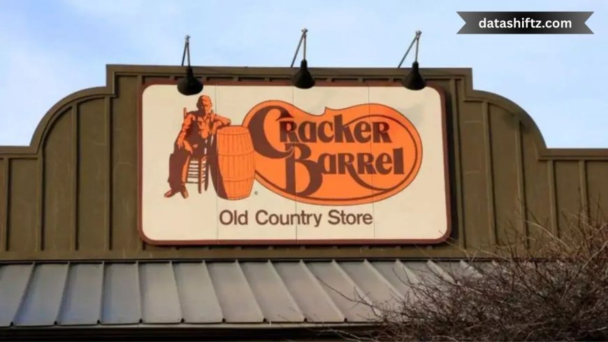
The old Cracker Barrel logo features a classic, hand-drawn illustration of a man sitting on a barrel outside a country store. This man represents the "cracker barrel" itself—an old barrel used as a gathering place where folks shared stories and company. The typography was simple and traditional, emphasizing warmth and familiarity.
-
Illustration: Man on a barrel with a walking stick.
-
Font style: Rustic and hand-crafted typeface.
-
Color scheme: Earthy tones like browns and yellows.
Why the Old Logo Still Matters
The logo was not just a graphic; it was a storytelling device. It conveyed the brand's roots in Southern culture and hospitality. The image of the man on the barrel connected customers to a sense of nostalgia and community, which helped establish trust and loyalty.
From Past to Present: How Cracker Barrel’s Logo Has Evolved
While the old logo remains a nostalgic symbol, Cracker Barrel has updated its branding to appeal to modern audiences. Below is a summary table comparing the old and new logo versions.
| Feature | Old Logo | New Logo |
|---|---|---|
| Illustration | Man sitting on a barrel | Simplified, less detailed |
| Font | Rustic, hand-drawn typeface | Cleaner, modern serif font |
| Color Palette | Earth tones (brown, yellow) | More vibrant and refined earth tones |
| Overall Style | Traditional, homey, detailed | Sleek, minimalistic, streamlined |
| Brand Message | Nostalgia, community, Southern tradition | Contemporary with roots in tradition |
Latest Buzz: What’s Happening with Cracker Barrel’s Classic Logo?
In recent months, Cracker Barrel has sparked conversations by embracing the heritage of its old logo while modernizing its brand image. Here are some of the key news highlights:
Revival of a Beloved Symbol
Cracker Barrel announced that it will reintroduce the classic logo on select merchandise and marketing campaigns. This move is part of a strategy to celebrate the brand’s rich history and cater to longtime fans.
Anniversary Celebrations Highlighting the Old Logo
The chain is also launching a special anniversary campaign featuring the old logo prominently. This campaign will include nostalgic promotions, limited-edition products, and a social media push highlighting the brand’s journey.
Fans Weigh In: Customer Reactions
The response from customers has been overwhelmingly positive. Many have expressed appreciation for the brand’s willingness to honor its past, seeing the old logo as a symbol of authenticity and comfort.
Why Logos Matter: The Power of Visual Identity in Branding
A logo is much more than just a graphic—it's the face of the brand. It sets the tone and tells a story, influencing customer perception. The Cracker Barrel old logo is a perfect example of how a well-designed logo can build emotional connections.
Top Reasons Classic Logos Continue to Thrive
Many brands choose to keep or revive their original logos for the following reasons:
-
Emotional connection: Nostalgia fosters brand loyalty.
-
Trust and familiarity: Recognizable logos build consumer trust.
-
Differentiation: Classic logos stand out in a world of constant change.
-
Storytelling: They communicate the brand’s heritage and values.
Looking Forward: What’s Next for Cracker Barrel’s Brand Identity?
While the old logo revival is exciting news for fans, Cracker Barrel is also moving forward with modern branding efforts. Here’s what the future might hold:
-
Digital presence enhancement: Updating website and social media with a mix of old and new logo elements.
-
Merchandising: Expanding vintage-themed product lines.
-
Store redesigns: Incorporating nostalgic design elements alongside modern aesthetics.
Recap: The Enduring Legacy of Cracker Barrel’s Old Logo
In summary, the Cracker Barrel old logo remains a cherished emblem of the brand’s Southern roots and traditional hospitality. The current news highlights a strategic revival of this classic logo, blending nostalgia with modern marketing efforts. For both longtime patrons and new customers, this move reinforces Cracker Barrel's commitment to authenticity while adapting to today’s market.
Quick Facts About the Cracker Barrel Old Logo
-
Founded in 1969.
-
Old logo features a man sitting on a barrel.
-
Represents Southern tradition and community.
-
Recently revived in merchandise and marketing.
-
Mix of old and new logos used for brand evolution.
Why Customers Keep Loving the Old Logo
-
Evokes memories of family and comfort food.
-
Symbolizes simple, wholesome values.
-
Reinforces a sense of belonging.
-
Represents a slower, more genuine lifestyle.
Final Reflections: The Cracker Barrel Logo as a Bridge Between Past and Present
Cracker Barrel’s decision to revisit its old logo is a testament to the power of heritage in branding. It’s a clever blend of honoring the past while embracing the future, something that few brands can execute as authentically. Whether you are a fan of Southern cooking or simply appreciate good design, the Cracker Barrel old logo is a symbol worth celebrating.